top of page
tools used
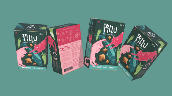
Pillu was a personal project that I later developed into a college class project. For a packaging class, we focused on both the graphics/visuals and the form and functionality of packaging, offering a comprehensive understanding. This project aims to create an ergonomic experience for the customer while standing out on market shelves with its aesthetic appeal.

Year:
2024
For:
Personal project turned college assignment
Project Type:
Logo design, packaging design


creating a playful yet legible logo, keeping in mind the friendly and child-like nature surrounding owning pets. Using fonts Chinchilla and Swung Note as inspiration for the design. Using a Cat eye as the symbol for the brand to be associated with cats.
#224637
#579E97
#95B76D
#0D5F66
#F7AEB7
#CE3E5A
An analogous color palette with green as the primary color to reflect the organic and natural nature of the product. To highlight the flavor, blue is used for mackerel, and pink is used for carrots instead of orange to maintain a harmonious and soft/pastel color palette.


Heading
Subheading
Body Text


swipe for further visual details!


bottom of page


